


Attorneys who adopted a "What, me worry?" attitude toward mobile websites are in for an attitude adjustment.
Google is making an epic shift in how it indexes websites, moving to new formulas weighted for mobile and dumping its traditional reliance on desktop as the gold standard.
What does that mean? Instead of judging your website based on how it performs for desktop users, Google will assess your website based on the needs of mobile users.
It's a Copernican Revolution that leaves no one out.
Up until now, some legal professionsl felt insulated from the brouhaha over mobile.
They were secure in the knowledge that prospective clients naturally gravitate to desktops for in-depth research. And, since Google judged and ranked websites using a desktop formula, they adopted a "why worry" attitude when it came to being mobile friendly.
But, if your website hasn’t gone mobile yet, Google's recent announcement indicates it's time to change. In fact, it's your only option.

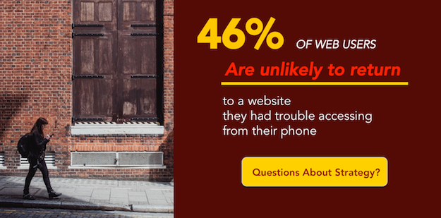
It's important to understand that even if the vast majority of prospective clients visit your website using a computer, that will soon no longer matter. Google intends to judge your website based on how it performs on a smartphone or tablet. And rank you accordingly.
If your website fails to pass this new, mobile bar then your website could slip out of sight in search results. And out of sight is out of mind.
The best place to hide a dead body is Page 2 of Google search results.
Testing for this new paradigm was announced by Google in early November 2016. By mid-November, search analysts spotted sporadic shifts in search results, leading them to believe they were seeing the first tests of a mobile-weighted algorithm.
If true, these early tremors indicate that a website’s mobile preparedness may dramatically influence its rankings in search results. One site saw an 80-place shift in its position in search results.
Thankfully for those who saw their search ranking sink in November, the fluctuations disappeared faster than Thanksgiving leftovers, buttressing the theory that these were indeed mobile index tests.
We can expect to see more of these now-you-see-them-now-you-don't blips as Google tinkers with its new algorithm. But these sneak peeks provide fair warning of coming attractions.
If you are wondering where you stand, Google offers a primer — Google Mobile Friendly Websites — for these next-gen websites. But here are a few of the core virtues:
“Speeding up websites is important — not just to site owners, but to all Internet users. Faster sites create happy users and we've seen in our internal studies that when a site responds slowly, visitors spend less time there...” — Google
To be fair, Google is serving up soothing reassurances that it doesn’t expect a big shift in rankings when its mobile index rolls out. But they are referring to the aggregate. The reality is that aggregate data is a poor predictor for individual experience.
The crucial question: How will your individual site fare in the shakeout?
There is one simple test – Google’s Mobile-Friendly Test – that will determine if your website at least passes the bare minimum criteria for being mobile friendly. Simply plug in your website's page URLs into the Google tool to see where you stand. (Here's Test help if you need it).
As we already noted, mobile friendly is a low bar. In the real world both Google and users alike prefer mobile responsive websites, which address user needs by gracefully resizing to accommodate the dimensions of any device: from widescreen expanses to the smaller, vertical format of a smartphone.
See how a responsive website resizes to fit on a smartphone's screen:

You can test how responsive your own website is by using either of these two methods:
Want Details?
If you haven’t gone mobile, there’s still time.
The recent fluctuations in search results were just tests and vanished quickly. But Google could act at any point and if the search aberrations we saw in November pan out, then websites that are not mobile friendly may be hit hard.
Take advantage of the current lull by taking steps now to upgrade your website to a responsive mobile design.

“My experience with Einstein has been amazing...Together we have created a website that presents my firm in the best light and according to the principles I embrace, our phone has started ringing off the wall…If you want to grow your firm or simply increase traffic to your website, this is the best and most complete answer to enhancing your online presence.” - Donna J. Smiedt, JD Family Law Attorney
ID#: 1723886440
Premier Partners are recognized among the top 3% of companies in the Google Premier Partners program.
